
Wondering if it’s time to upgrade to Office 2021? Discover the new...
If you’re aiming to transform raw data into meaningful business insights, Power BI dashboards are an ideal solution—especially when paired with Office 2024 Excel data. In this guide, we'll explore Power BI dashboard examples tailored to real-world needs, with a focus on sales, performance, and Excel-based reporting.
If you're looking to turn your business data into clear, visual insights, Power BI is one of the most powerful tools available today. Developed by Microsoft, Power BI allows users to create interactive dashboards and reports that bring data to life—especially when paired with Office 2024 Excel. Whether you're tracking sales, analyzing trends, or presenting KPIs, Power BI helps you convert raw Excel spreadsheets into actionable visuals that are easy to understand and share across your team.
Many beginners often ask, "Is Power BI easy to learn?" The answer is yes—especially with its drag-and-drop interface and seamless Excel integration. Plus, Power BI Desktop is free, making it accessible for individuals and small businesses to get started. And no, Power BI does not require coding for most of its features, which makes it a favorite among non-technical users. Why is Power BI used? Because it simplifies data analysis, accelerates decision-making, and works perfectly with familiar tools like Excel 2024, making business intelligence both powerful and user-friendly.
By the end, you’ll have a clear understanding of how to design, visualize, and share interactive dashboards for decision-making, using the data you already manage in Office 2024.

A Power BI dashboard is a visual storytelling tool that allows users to monitor key metrics and make data-driven decisions. Unlike traditional reports, dashboards in Power BI are interactive, real-time, and integrate multiple data sources like Excel, SQL, and cloud services.
With the release of Office 2024, Excel files are even more compatible with Power BI, making the reporting process faster and more streamlined. Whether you're managing a small business or handling corporate analytics, dashboards can bridge the gap between complex spreadsheets and actionable insights.
Power BI is widely used across industries for:
Companies rely on Power BI sales dashboards to monitor trends like revenue growth, lead conversion, and regional performance. The real-time nature of these dashboards allows teams to respond quickly to market changes.
With Office 2024, Excel now offers faster performance and enhanced cloud integration, allowing for smoother and more efficient use within Power BI workflows. Here are a few key advantages:
You no longer need to manually import spreadsheets; Power BI automatically connects and updates data from Excel files stored in OneDrive or SharePoint.
Let’s walk through how a Power BI dashboard for sales might look:
By using slicers and filters, users can drill down into specific time periods, product lines, or sales reps. It helps managers quickly extract insights without manually scanning through extensive Excel data.
Creating a high-impact Power BI sales dashboard requires thoughtful design. Here are a few best practices:
With these tips, your dashboard not only becomes more readable but also more actionable for users at all levels.

Power BI reports using Excel are among the most common use cases. Here’s how to connect and visualize your data effectively:
This workflow ensures your Excel data stays the foundation of your analysis while Power BI brings it to life visually.
Let’s imagine you’re a regional sales manager overseeing three zones. A well-designed sales performance dashboard in Power BI might include:
This type of dashboard gives your team visibility into what's working and what needs improvement.
If you're looking to speed up your development process, you can find ready-to-use Power BI sales dashboard templates online. These include sample data and visuals, so you can quickly customize them for your business needs.
Ideas for templates:
Templates help ensure consistent branding and save hours of work.
Here’s a simple breakdown:
With Office 2024 Excel, the process is even smoother, and auto-refresh keeps everything up to date.
No. Power BI Pro is a separate license. However, Excel 2024 integrates well with Power BI, and you can use Excel files within Power BI reports without needing Office 365.
Absolutely. Power BI is optimized to work with Excel files (.xlsx, .xlsm), especially when they are formatted as tables or named ranges.
A dashboard is a one-page summary, pulling visuals from multiple reports or datasets. Reports in Power BI are multi-page documents that dive into various datasets or key performance areas.
Power BI dashboard examples show us how powerful data visualization can be—especially when combined with Office 2024 Excel files. From sales performance tracking to dynamic reporting, Power BI provides tools that modern businesses need to stay ahead.
Whether you're new to Power BI or already building advanced visuals, these dashboards help you unlock real value from your data. Start with your existing Excel files, explore templates, and design interactive dashboards that speak louder than spreadsheets.


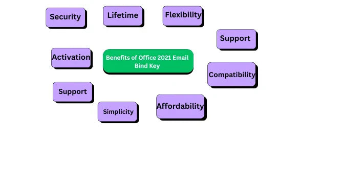
IntroductionWhen choosing between an Email Bind Key and Product Key for Microsoft...


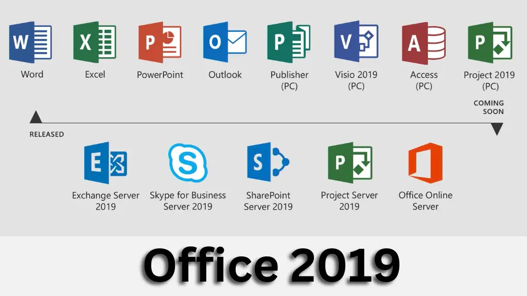
Microsoft Office Professional Plus 2019 is a comprehensive suite of productivity tools...

Wishlist is empty.
Leave a comment